Is Creative Resume Design Ruining Your Job Search?
Author: Lisa McGrimmon | First published: March 27, 2019
There's a lot of buzz online about creative resume design. Two column, modern resumes look great, but they also cause all kinds of problems that can destroy your very best job search efforts. Here's how to make sure a terrible resume template isn't hurting your career.
If you spend any time at all searching for resume templates or formatting tips, you're going to find examples of nontraditional resume templates that are promoted by their designers as being more modern and memorable than traditional resumes.
Creative resume designs, without a doubt, are eye-catching when compared with traditional resumes. They do look more modern, and they are memorable, but that does not mean they are more effective.
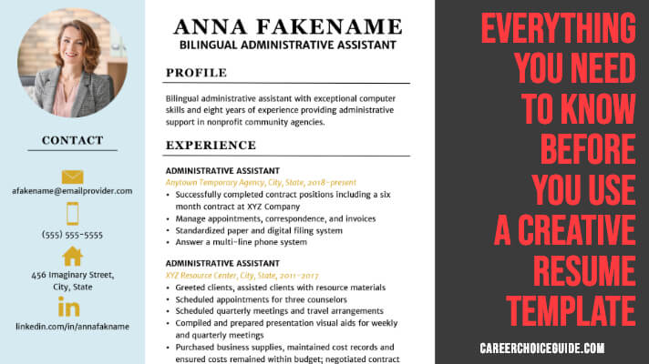
A more conspicuous resume isn't necessarily a better resume.
What job seekers really need to consider, is whether creative resume designs are actually likely to get you invited to interviews.
A resume's task is to get you invited to a job interview. It doesn't matter how pretty or eye-catching your resume is. If you're not getting invitations to job interviews, your resume isn't doing its job.
With that task in mind, let's assess some creative resume designs and determine whether they are likely to do their job and get you invited to interviews.
To better understand whether you should use a creative resume design, we'll look at:
- What is a creative resume
- Some sample creative resumes vs. a traditional resume
- Key differences between creative resume design and traditional resume design
- Effectiveness of creative resume design vs. traditional resume design
- Why creative resume design has popped up everywhere online
- How to design an effective resume
What, exactly, is creative resume design?
I want show you some examples of creative resume design, so you can see exactly what I'm talking about when I refer to creative resumes vs. traditional, simple resumes. However, I don't want to link to any of those creative resume templates.
Luckily, I'm pretty handy with image editing software, so I made a couple of mockups of what you'll typically see in creative resume design. I've spent a lot of time researching creative resumes, and the mockups I've designed are quite typical of the templates people sell online.
I've also created a mockup of a traditional resume, so you can see the key differences.
Sample Traditional Resume
Let's start with the familiar, traditional resume.
You'll find no big surprises here. It's the type of resume employers are familiar with, and it's the type of resume you'll likely create if you work with a professional career advisor.
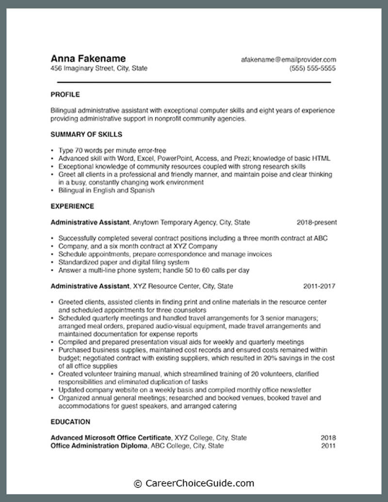
Typical features of a traditional resume include:
- Written using a word processing file with no pre-existing formatting (i.e. not a template)
- Single column design
- Black and white (The dark borders around all three resumes mockups I've created are not part of the design)
- No images or icons
- Content organized under predictable headings which might include: profile, skills summary, work experience, education
- Bulleted lists describing skills, experience and accomplishments, ideally using clear, concise, and descriptive language
- Single, professional, and common font
Sample Creative Resumes
Now, let's look at a couple of creative resumes.
When I refer to creative, modern, or high design resume templates, the two examples below are the kinds of resume designs I'm talking about.
Both examples below feature career information that was used in the traditional resume template pictured above, so you can see how the same information fits on different layouts.
The white letters in red circles on both creative resume mockups refer to numbered points described below the images.
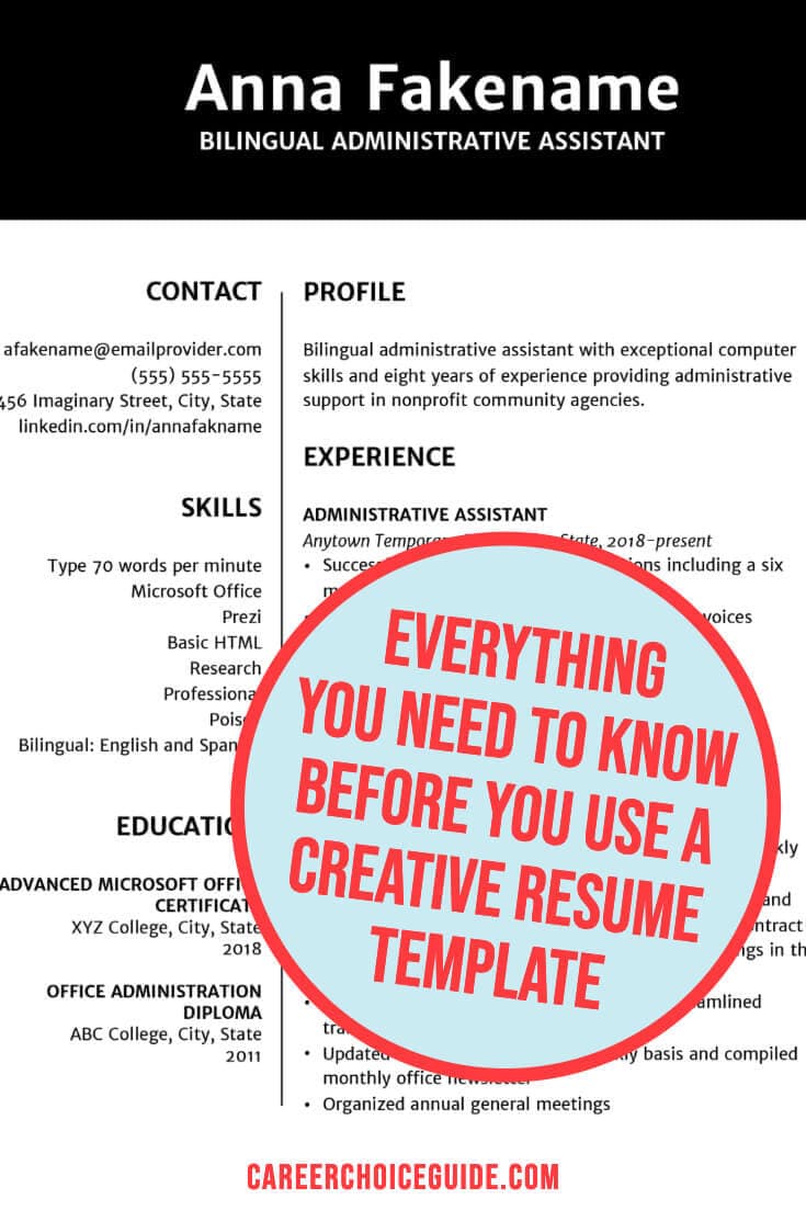
A Typical, Simple Creative Resume Template
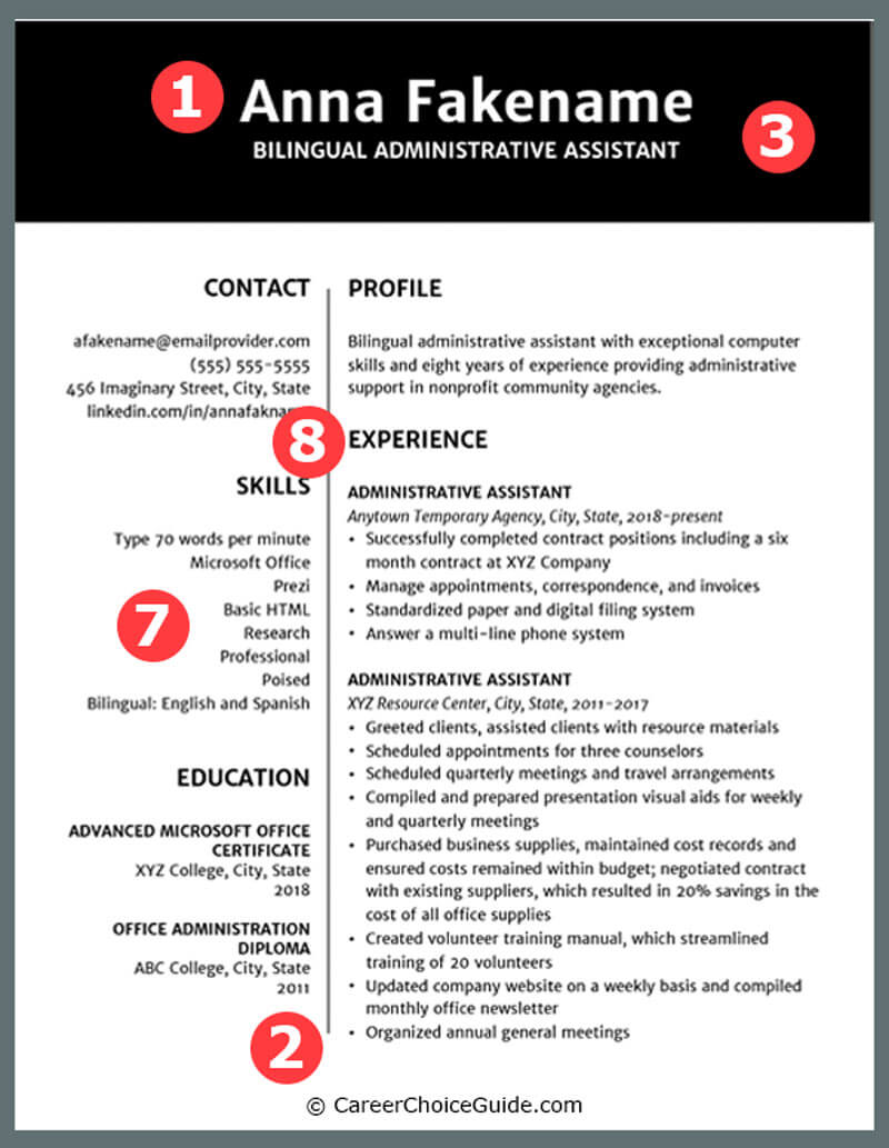
First up, here's a fairly simple and restrained version of a creative resume template. There's a typical two column design, with a large, decorative header and non-standard layout.
This resume mockup doesn't use color, but it does feature a lot of black. The two column design provides less room for descriptive bulleted points, so the skills description and work experience had to be shortened drastically (compared with the traditional resume pictured above) to fit the template.
The left column is quite narrow. If this job seeker had a longer email address or LinkedIn profile URL, they would not have fit in the space provided.
A More Elaborate Creative Resume Mockup
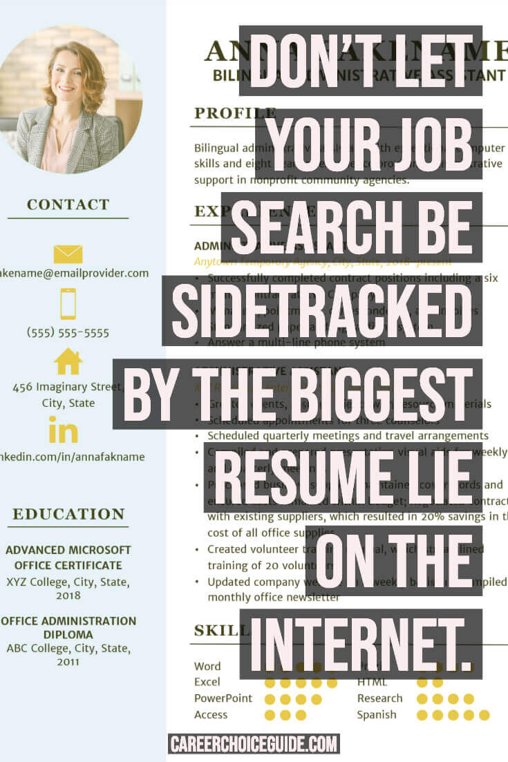
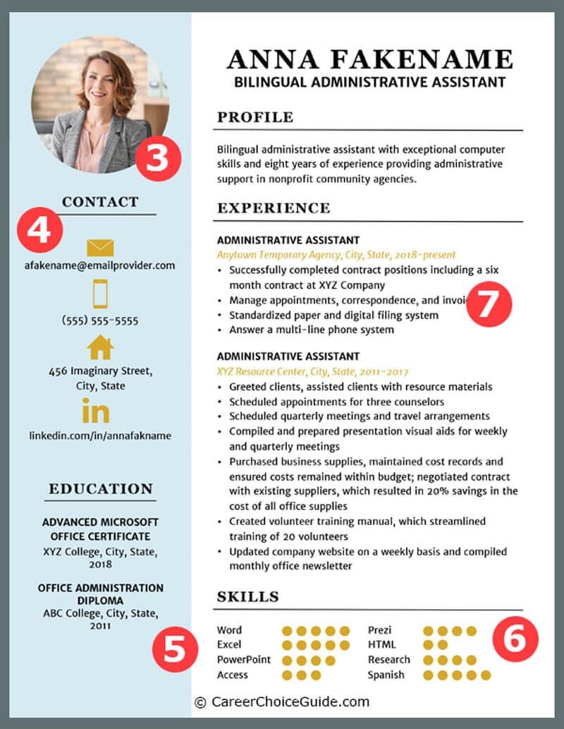
The next resume mockup, pictured below, is more elaborate but still typical of the creative resume templates you'll find online.
In addition to non-standard organization, two column layout that leaves less room for detailed skills and experience descriptions, this resume also demonstrates other features typical of creative resumes including:
- a photo of the job seeker
- icons
- extensive color
- a graph to depict skill level
The graph takes up substantial space and leaves very limited room for informative, descriptive, bulleted points.
Typical features of a creative resume include:
- Written using a preformatted template
- Two column design
- Substantial use of color or black
- Icons and photos
- Non-standard sections and layout
- Dots or bar graphs to indicate skill levels
- Less use of descriptive, bulleted lists to communicate skills, accomplishments, and experience.
- Decorative, and less common fonts, vertical lines, or text arranged vertically
How effective are these sample creative resumes?
If you haven't guessed already from my tone, I think creative resumes do a terrible job of getting job seekers invited to interviews. They might be pretty, but they typically lack substance, and there are more effective ways to format your resume and grab attention.
In order to have a chance of being invited to a job interview, your resume must either:
- Pass screening through applicant tracking system software, scoring well enough that a human will actually look at your resume.
- Pass manual screening by a human, quickly and clearly demonstrating that you are qualified enough to merit an interview.
In my opinion, a creative resume template is not the best tool to accomplish either of those tasks.
Here's why I wouldn't recommend using a creative resume template:
1. Written using a preformatted template
It's always a mistake to use a template to format a resume.
That statement will ruffle the feathers of anyone who sells resume templates, but I stand by it.
I've written over 1000 resumes, and one thing all of that resume writing has taught me is that formatting is the last thing you do, not the first thing. My career advisor friends, who have also written or critiqued hundreds of resumes agree that templates are not the way to go when writing a resume.
In good resume writing, content comes first. Always.
You can't format your resume well until you know what information you're working with, what needs to be highlighted, and what needs to be minimized. Only then can you organize that information in the most effective manner.
Anyone who says resume templates are fine because all work histories fall into a similar pattern is either unaware of or deliberately dismissing:
- the vast differences in people's work histories and the effective strategies available to make the most of different work histories
- the impactful changes you can make to your resume layout and organization to highlight the best of your work history and minimize concerns
- the fact that templates don't give you the freedom to make those changes that show you at your best
All resume templates, whether their design is creative or traditional, are too limiting.
If you confine yourself to the layout of a template, you're locked into someone else's design that doesn't take your work history into account. You won't have the flexibility to change the order and layout of each section of your resume to arrange your experience in a way that shows you at your best.
I earn a commission for purchases made through links on this page. To learn more, please see my disclosure.
You'll waste a lot of time trying to make your content sit well on the page.
It's tough to change the size of sections on a template, and if you do change them, you will likely ruin the aesthetics of the template. You're stuck with the designer's formatting choices.
In fact, on the two creative resume formats pictured above, the fictional job seeker's email address and LinkedIn URL wouldn't fit on the left column until I made the font quite small. Also, many of the bulleted points used in the original resume with traditional formatting didn't fit in the available sections and had to be drastically edited, making them less descriptive.
If different elements of your skills, education, and experience don't fit within the confines of the template, you'll be stuck adjusting your content to fit the design. In other words, you'll be putting formatting ahead of content.
My step by step resume writing workbook has 16 chapters in total. It doesn't even touch formatting until chapter 12.
Working on formatting before your content is written is a huge waste of time.
2. Two column design
The two column design that's typical of creative resumes typically can't be read by ATS software, and it takes up a lot of space that could better be used describing your skills.
ATS software doesn't do well with resume formats that have underlying columns, tables or non-standard formatting.
Applicant tracking system software is programmed to "parse" the contents of your resume. Parsing a resume simply means the software searches your resume for elements like education and work experience, organizes those elements, and scores them based on the employer's criteria. The more points the ATS software gives your resume, the better chance you have of being invited to a job interview.
The software is programmed to look for that information in certain predictable places on your resume and in certain predictable formats. If your resume is formatted in a non-standard way, or uses tables, columns or other underlying formatting, the ATS software won't understand how to read your resume.
If the software can't read your resume because you've used columns, tables, or non-standard formatting, you won't get points for having the qualifications the employer requires. Then, no matter how well qualified you are for the job, you'll fail the ATS screening.
Two column design wastes a lot of space.
All you have to do is compare the traditional resume (below left) against one of the creative resumes (below right) to see that the two column design of a typical creative resume gives you far less space to describe your qualifications.
You don't have to read each resume in detail, but a quick scan will reveal I had to eliminate a lot of information to make the fictional job seeker's work history from the traditional resume fit on the creative resume.
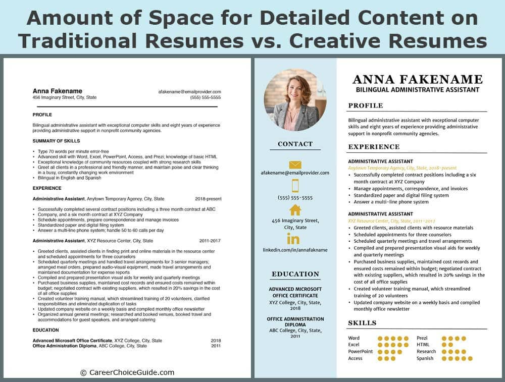
The left vertical column you often see on creative resume templates takes up at least one quarter of the page. Because that column is so narrow, there's not a lot of information you can put in that space.
The left column is only appropriate for brief bits of information like your name and contact information. You may also list key skills in the left column, but there isn't room for detail, and listing key skills on a resume without proving them isn't particularly effective.
Saying you have a skill doesn't prove you have a skill. It's far better to take a full line and describe that skill clearly and convincingly. Anyone can write on their resume that they have good time management skills, but the person who can prove that on their resume with a well written point will make a better impression.
Also, on a traditional resume, your contact information can take up as little as two or three lines. On the other hand, using an entire column for your contact information steals away almost 25% of the space you could otherwise be using to prove to the employer that you're a great candidate for the job.
3. Substantial use of color
Every creative resume template I've seen uses a lot of color. Even those few creative templates that are in black and white have big swaths of black.
All of that color might be fine on a computer screen, but what if the employer wants to print your resume?
Employers certainly won't print all of the resumes they receive, but they might want to print the resumes belonging to the most promising candidates for closer review and consideration. Plenty of people think better on paper than on a computer screen, and those types of employers will want to print your resume.
If printing your resume is going to be a giant waste of printer ink, you're going to annoy a lot of employers. Plus, if the hiring manager doesn't have access to a good color printer, your colorful resume that looks pretty on a computer screen will look terrible on paper.
Classic resumes use black ink only, and they require no more ink to print than any other standard business document that a person in a typical office might need to print. They won't cause any concern for an employer who prefers to print resumes and review them on paper.
4. Icons and photos
You'll find a lot of creative resumes use icons or even photos of the job seeker to enhance the design.
Why are icons and photos of yourself a problem on your resume?
ATS software does not handle icons and images well. Icons and images can confuse the software and cause it to fail to parse your resume correctly. If your resume confuses the ATS software, that's a guarantee that no human will never see your resume.
Including a photo of yourself on your resume can also be a problem if resumes are filtered manually by a human reviewer. Your photo gives away all kinds of information that, ideally, should not be part of the hiring process.
In fact, in order to avoid potential claims of hiring discrimination, some employers won't consider any candidates who have included a photo on their resume. Others think it shows a lack of professionalism, so that photo, no matter how great it looks, can make a bad first impression.
Plus, a photo takes up space on your resume, and that is space that you could otherwise use to include information that shows you're a strong candidate for the job.
5. Non-standard sections and layout
We've already examined reasons why a non-standard layout causes problems when an ATS is grading your resume. Non-standard formatting can be difficult for human readers as well.
Employers sorting through resumes expect those resumes to follow certain conventions and standard organization and layout. There can be variation within that layout and organization, but on a traditional resume, that variation falls within boundaries that fit employers' expectations.
On a creative resume, the layout and organization is vastly different from what the employer expects. Resume template designers promote that as a positive attribute saying it will make your resume stand out.
However, a resume that has an unusual organization and layout takes longer to assess because employers have to take extra time to orient themselves to the layout and organization of your resume. When the employer can't, at a glance, find the most critical information on your resume, your resume has failed to do its job.
6. Dots or bar graphs to indicate skill levels
Some creative resume templates use dot or bar graphs that are intended to indicate your level of expertise with key skills. These graphs are completely meaningless.
Those little graphs are cute, but they don't prove anything to an employer. You might think your event planning skills are worth four out of five dots on your chart, and your time management skills are worth five out of five dots, but your assessment of those skills on a little graph is completely meaningless to an employer.
Self-rating your skills on a dot or bar graph:
- Proves nothing about your skills in those areas; it's just your subjective assessment.
- Does nothing to clarify your accomplishments and experience.
- Gives no evidence that you are a superior candidate compared with other applicants.
Those charts take up a lot of space on your resume without proving anything about your actual level of skill in key areas.
7. Less use of descriptive, bulleted lists to communicate skills, accomplishments, and experience.
The design features typically found on creative resumes - multiple columns, icons, photos, graphs - take up a lot of space. They don't leave much room for writing clear, concise but detailed points that give concrete evidence that you are a strong candidate for the job.
There's very little room to indicate why you are superior to other candidates who have the same qualifications when a large portion of the page is taken up by columns, photos, and graphs.
A traditional resume format gives you plenty of space to write clear, effective statements that can be read at a glance and demonstrate your level of skill and experience in key areas.
8. Decorative, and less common fonts, vertical lines, or text arranged vertically
Uncommon fonts don't work on everyone's computer, and the same is true for some icons. If your creative resume uses an uncommon font that isn't installed on the employer's computer, that fancy font will be automatically replaced by a different font, which may completely throw off the formatting and aesthetics of the template.
Of course, people who use creative templates are advised to save their resumes as PDF files, which will keep the design intact on any computer. The problem with that advice is, not all employers want resumes delivered in a PDF format. If the employer asks for any other type of file, your creative resume could end up looking terrible on the employer's screen.
We've already established that there are plenty of features in a creative resume that just won't work with applicant tracking system software. You can add fancy fonts and lines to that list of reasons why a creative resume is likely to fail ATS screening.
If creative resumes aren't effective, why are they everywhere online?
- Creative resumes are sexier and more exciting than classic resumes, so they generate more attention.
- People who aren't professional career advisors profit from selling creative resume templates.
Creative resumes are sexier and more exciting than classic resumes, so they generate more attention.
Images of creative resumes garner attention online because they are eye-catching and different from what people expect in resume design. People react to those pretty resumes, linking to them, liking them, and sharing them on social media.
All of that reaction helps to get creative resumes a place at the top of search engine ranking and plenty of visibility on social media platforms. That visibility then encourages more people to write about creative resumes.
People, understandably, don't get as excited about classic resumes, so those resumes don't generate the same excitement online.
People who aren't professional career advisors can profit from selling creative resume templates.
If you're a designer, you can sell resume templates.
You may have absolutely no experience as a professional career advisor, and you might not know the first thing about writing effective content for a resume, but if you have basic design skills, you can design creative resume templates to sell online.
Designers might not grasp how ineffective those templates can be. If they have seen other people selling templates, and they have never actually been responsible for clients' job search outcomes, they might not realize all of the problems with their templates.
Where can I get resume advice I can trust?
If you shouldn't use creative resume templates, then how can you write an effective resume?
Some people who sell resume templates say career advisors can't be trusted. They toss out accusations of bias, saying career advisors don't like creative resume templates because job seekers can just use a template instead of hiring a career advisor.
That criticism couldn't be further from the truth. It completely misses the point of what a professional career advisor does.
Professional career advisors do far more than make a general work history look attractive on a page. They also:
- Work with you to gather all of your career-related information, helping you to brainstorm and outline everything that might be relevant to your job search.
- Write that information in a way that helps to prove you didn't just do the job, but that you were great at your job.
- Organize that information in a way that shows you at your best, highlighting your strengths and minimizing any possible weaknesses.
- Discuss recruitment issues with employers every chance they get, so they are well-aware of employers' current needs and expectations and can use that knowledge to help you write a better resume.
Professional career advisors don't criticize resume templates because they fear templates will make them lose clients. They criticize resume templates because they care about job seekers, and they fear those templates will keep people from finding great jobs.
I would always the advice of career advisors who:
- have written or critiqued a lot of resumes, so they know the huge variety of work history concerns people have and how to address them effectively on a resume
- have been accountable in some way for their clients' job search outcomes, so they have proof that their methods work
You wouldn't hire a career advisor to design a logo for your new business, and you shouldn't hire a graphic designer to help you create a resume.
Where to get trustworthy resume writing advice:
Consider Working With a Professional Career Advisor
If it's in your budget to hire a professional career advisor, or if you're fortunate to live in a location where you can access job search services for free, a competent, qualified career advisor can be immensely helpful.
A study by The Ladders, called Keeping an Eye on Recruiter Behavior, examined how recruiters review resumes. Researchers compared self-written resumes to resumes that were rewritten by professional career advisors. Recruiters preferred the professionally written resumes and ranked them 60% more useable and easier to read.
If you do decide to work with someone, (especially if you're paying them) be sure to check out their credentials and experience. Anyone can call themselves a resume writer, and there are resume writing credentials that sound impressive but actually aren't that difficult to get and don't prove much about a person's skill.
Before committing to working with a career advisor, ask them how many resumes they have written. Then ask them about the success rate of their clients. Specifically, ask what percentage of their clients are working and how long it took them to find work.
Don't be drawn in by someone who mentions a couple of impressive companies that have hired their clients. That doesn't mean much; those clients might be the exception. Ideally, you want to know specifically how their clients do overall in finding work.
Career advisors who track that data and can give you reasonable answers to those questions have a degree of accountable to the success of their clients. If a resume writer does no followup on their clients' job search outcomes, you (and they) have no way of knowing if their resume writing strategies are effective.
My Resume Writing Guide
I've published a book on Amazon called The Resume Writing Guide. It's a step by step workbook that takes you through the entire process I would go through when writing a resume with a client.
I wrote this book for anyone who isn't able to work in person with a good career advisor. It's a thorough book that will answer all kinds of questions and concerns people have about presenting their work history effectively.
You won't write a resume in 15 minutes with this book. It will take some time, but in the end, if you do each task in the book to the best of your ability, you'll have a resume that shows you at your best.
More Resume Writing Information
If you want to dive in to read more about resume writing, I've written 60+ articles on the topic. You can find links to all of them here.
More Online Resume Writing Advice
Unfortunately, there are a lot of people giving resume writing advice online who have never been responsible for helping real people find real jobs. While there are some fabulous career advisors sharing wonderful job search advice online, there is also a lot of terrible advice out there.
It's almost impossible to avoid the bad advice, and the bad advice is hard to detect if you're just learning about resume writing.
If you want to look up more resume writing and job search advice online, I'd suggest starting with the career services department at local colleges or universities. Staff at college and university career services are professional career advisors with plenty of experience helping real people find work.
Just search search on Google for college career services or university career services, and you'll get the links to the career services departments for schools near you. Click on a few, and look for a link to job search or resume writing information.
You can often find free job search tips sheets and even full job search ebooks on university career services websites. The people who write that information know what employers are really expecting when they review resumes.
Not all school career services departments post job search advice online, but many do, and any advice I've read on sites like these has been good advice.
